Magazine Advertisement
Basic Idea
For my Magazine advertisement, I want to include an image of the artist playing an instrument that was used in the song I have recorded. This instrument ("piano") has also been used originally in my music video and on the front cover of my album. I believe this will create a sence of continuity between my anchillary products. I would also like to use the "naive" album title that has been used in all my products so far. This is because not only do I believe that it will again create a sence of continuity between my products, yet also I want to create a kind of font related trademark that my artist will be recognised from. My inspiration for this came from viewing Blur's album cover where they have also done this with the font of the band's name. Finally I must iclude conventions that are used frequently in magazine advertisements. This includes the date of the album's release, what media products it is being released as e.g LP or CD delux, and if the album is available to download.
First attempt at magazine Advertisement Product
Editing Process
Image
This is my first attempt at creating a Magazine Advertisement. I have edited the image in photo shop by changing the image into a black and white picture, then placing different coloured text boxes onto the paino keys. Next, I have inserted the album title then cropped and positioned it onto the centre of the image.
Text
I have inserted the text concerning the album's release on top of the paino keys in my main image. After inserting my image into Microsoft Publisher, I have made the background of the document black, and added the band's name an website in a bold,red font.
Further Annotation
I have used an image of the artist playing an instrument,that was used in the song I have recorded, for my main image. I have used this as it reinforces, not only the continuity between my anchillarry products, yet also it reinforces the mystery based around who the artist/band is which is a consistant theme throughout my work.
My original inspiration for this came from viewing the album cover of a genre related band(The drums) which also uses this on the front cover to inforce some kind of band related mystery. Which, as a result keeps the audience's interest more so than if there was none.For my main image, I have used a black and white image while also inserting coloured text boxes onto some keys. From this,not only is my magazine advertisement cositsatant with somke elements used in my album cover(the use of black and white images on the album back) yet also by using brightly coloured keys in my advertisement, it makes it more visually attractive and intriging. I have used a red,bold text for the band's name. From this, the audience will be able to clearly read the text, yet the use of red text against a black background also makes the text clearer. I have also underlined the text to portray the importance of this to my magazine advertisement. Yet this use of red text is also consistant with the text that has been used throughout my anchillarry products.
Improvements
Final Piece
Thursday, 24 March 2011
Wednesday, 23 March 2011
Creating My Products- C.D Back
Back Of Album Cover
For the back of the Album Cover, I would like to use an image of the Artist. This is because I believe that by doing so, my audience will be able to identify who the music contained in the album is by. The tile of the album/song with also be used on the back of the album. This will create a sense of continuity between both the front and back of my Album cover yet also a sense of continuity between the album and my other Ancillary products. I will also include other features that are used frequently in other album covers such as, the record company, the names of those who were involved in the process of creating the album and a barcode.
Image for Back of C.D
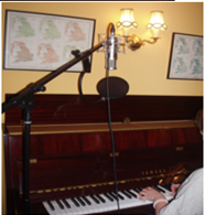
This is the image of the artist I have chosen for the back of my C.D cover
First Attempt- back cover of Album
Futher Annotation
I have used a photo of the artist playing a piano for the main image of my album back. I believe this is effective as it means that my audience are able to identify the instruments that have been used yet also the type of ensemble of the music. This image also creates a sence of continuity between the back and front of the album cover as a image of a piano is used in both. My inspiration for incorparating an image of the instruments used came from viewing the Kooks album cover which also uses this.
I have also used an image of the song's/albums title on the inside cover of the piano. By doing this I have created a sence of continuity between the front snd back of my album cover yet also between my other Ancillary products. Furthermore by doing this, I hope to have created a kind of text related trade mark that when seen will be immediantly associated with the band/ artist I have used.
I have made the main image black and white as I think as a result of this my cover appears more artistic. Yet also as the audience are only presented with the arm of the muscian, the artist appears more mysterious and intriging. The mono chrome image also contrasts well with the colourful front cover making it more visually effective. Yet also as a result of this, The bright red text stands out making it clear and eyecatching.
The text I have used is in red. By doing this I have created a sence of continuity between the front and back of the album cover. I have also incorparated the length of the songs on the Track listings to make my album cover appear more proffessional as a result of using conventions that are frequently used on album cover back's. Finally I have immported a barcode to again make my album cover appear more professional.
Improvements
For the back of the Album Cover, I would like to use an image of the Artist. This is because I believe that by doing so, my audience will be able to identify who the music contained in the album is by. The tile of the album/song with also be used on the back of the album. This will create a sense of continuity between both the front and back of my Album cover yet also a sense of continuity between the album and my other Ancillary products. I will also include other features that are used frequently in other album covers such as, the record company, the names of those who were involved in the process of creating the album and a barcode.
Image for Back of C.D
This is the image of the artist I have chosen for the back of my C.D cover

First Attempt- back cover of Album
Editing Process
This is the first attempt of the album back of my C.D product. I have used the first image that was selected from before to be the background. I have used Adobe Photoshop to edit the image. I edited the image by democrating it into a black and white image. Next I have imported the image of the songs/album's title, that was also used on the front cover, onto the image of the piano.After, I have inseted text which includes the Band's/ Artist's name, Track listing, and the band's website.
Futher Annotation
I have used a photo of the artist playing a piano for the main image of my album back. I believe this is effective as it means that my audience are able to identify the instruments that have been used yet also the type of ensemble of the music. This image also creates a sence of continuity between the back and front of the album cover as a image of a piano is used in both. My inspiration for incorparating an image of the instruments used came from viewing the Kooks album cover which also uses this.
I have also used an image of the song's/albums title on the inside cover of the piano. By doing this I have created a sence of continuity between the front snd back of my album cover yet also between my other Ancillary products. Furthermore by doing this, I hope to have created a kind of text related trade mark that when seen will be immediantly associated with the band/ artist I have used.
I have made the main image black and white as I think as a result of this my cover appears more artistic. Yet also as the audience are only presented with the arm of the muscian, the artist appears more mysterious and intriging. The mono chrome image also contrasts well with the colourful front cover making it more visually effective. Yet also as a result of this, The bright red text stands out making it clear and eyecatching.
The text I have used is in red. By doing this I have created a sence of continuity between the front and back of the album cover. I have also incorparated the length of the songs on the Track listings to make my album cover appear more proffessional as a result of using conventions that are frequently used on album cover back's. Finally I have immported a barcode to again make my album cover appear more professional.
Improvements
Creating My Products- C.D cover
Front of Album Cover
Basic Idea
For the Front cover of the album that I must create for one of my Ancillary Products, I am using an image that incorporates both, a prop that was used in my Music video, yet also the name of the recorded song that my Music Video was based upon.
The image on the Front cover will be a "Piano" that was used in my Music Video originally. The title of the song will be written on top of this by hand. I believe that by doing this, it will create an album cover that appears more personal, yet also more artistic. This was influenced by the "DRUMS" album cover which also uses a Font that appears to be hand written. The colour of the font that will be used in the song title is the same as the colours of nail vanish used in my Music video. This will create a sense of continuity between the Ancillary products, yet will also create some form of colour based trade mark where from this, the audience will be able to identify this particular artist. I would also like to incorporate the checked shirt that was worn by the artist in my Music Video in some form as I believe that again this will create a sense of continuity between my products. Yet I would also like to include this as I believe it will portray the genre of music through an item of clothing which is stereotypically thought of as an Indie/Alternative Item of clothing.
Photoshoot For Album Cover
Possible Front Cover images
In the Photo shoot for the front of my album cover, I have experimented with different shot types,lighting,and camera settings. I have narrowed this selection down to three images which I believe will be more appropriate, and visually affective for the front of my album cover
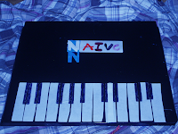 The third image I have chosen is a high-angle shot with a blue tint. I believe that this is effective as not only does the tint make it visually appealing, yet it also reflects the slightly sombre mood of the song that the album itself has been created for. It uses a kind of pathetic fallacy. The piano,and shirt that was used originally in my music video can both be seen. From this it creates a sense a continuity throughout the products I have created. However, as a result of using a blue tint, the title of the song is not as bright and eye catching as I want it to be, meaning that it is not the most significant part of the front cover. Though this can be edited in Microsoft Photo shop.
C.D Cover- First attempt
Editing Process
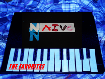
This is my First attempt at creating the cover of my album. I have used the third image that was selected from before to be the background of the album cover. To create this album cover, I have used Microsoft Photo shop to edit the image. I edited the image by using both the sharpen and fake Tilt-shift tool to give the image a slightly blurry effect, yet to also make the blue tint more prominent. Next, I have imported another image (image one from the selection process) cropped then resized it onto the centre of the main image. By doing this I have made the tile of the song and album the main vocal point. Finally I have added the name of the Artist/Band using the Text button.
Further Annotation
For the main image of the front cover, I have made it slightly blurry and made the blue tint more prominent. This is because I wanted the title of the song/ album to be the most visually captivating element of the album. I also wanted the colour of the shirt to reflect the slightly sombre mood of the song that I have created both a Music video and Album cover for. I believe the use of the checked shirt is effective as it means that my audience will be able to identify the specific genre I have created this album cover for, as a result of being visually introduced to a piece of clothing that is stereotypically thought of as being part of the Indie/ Alternative subculture/genre.
My influence for using a piece of clothing that relates to a specific genre came from viewing "the drums" album cover which also uses this technique. The main image itself is of a handmade "piano" that was used originally in my Music Video. My influences for using this idea came from both, the stop animation video"Her morning glory" which uses household items to create different objects, by doing this, a kind of foolery directed toward the audience occurs. Another influence came from the album cover of "blur" who also used images from their music videos. However, my main influence for using the "piano" on the front of my album cover came from viewing "the kooks" album cover. This is because they have used instruments on the front of their album cover,that was used to create their music. I have also done this as I believe that by doing so, it gives the audience insight on what type of genre and ensemble the music contained within the album is.
The font I have used for my album cover is the title of the song/album that I have edited onto my front cover using a previously taken photograph. The font on this image is colourful and clear. From this I believe that my album cover will portray the youthful age of my audience, yet can also be easily read and understood by the viewer. I also believe that as a result of using what was originally hand written font, the album cover appears more personal to the musician. Finally I have used red font that is also underlined and bold for the artist's/band's name. By doing this, it is clear to the audience who the band is, yet also stands out against the white "piano" keys making it visually attractive.
Improvements
Final- C.D Cover
Photoshoot For Album Cover
Possible Front Cover images
In the Photo shoot for the front of my album cover, I have experimented with different shot types,lighting,and camera settings. I have narrowed this selection down to three images which I believe will be more appropriate, and visually affective for the front of my album cover
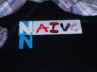
The first image is a crane-shot yet also close-up of the song title. I believe that the colourful hand written song title works well against the dark background making it visually attractive. I also believe as a result of the handwritten font, a more personal and artistic visual portrayal is present.
For the letter N I have used both blue and white font. I believe that again by doing this it makes the Front cover of the album more visually pleasing. For the Font, I have used colours that were also used in my music Video,this can be seen in the nail vanish used in the video.This creates a sense of continuity between my products, yet also, by doing this I hope to create a kind of colour-based trademark that the artist I have used will be associated with.
 The second image I have chosen a close-up of the songs title. However, in this shot the checked shirt, also used in my music video can be seen.
I believe that the checked shirt works well as the colours of the shirt contrast against the dark background making it visually attractive. The shirt also portrays the genre of the music as it is an item of clothing stereotypically associated with the Indie/alternative subculture and genre. I also believe that as a result of the colourful font that is used, the album appears more youthful. Therefore it is consistent with my target audience, who,after discovering through the questionnaire I
have created are mainly between the ages of 16-25.
For the letter N I have used both blue and white font. I believe that again by doing this it makes the Front cover of the album more visually pleasing. For the Font, I have used colours that were also used in my music Video,this can be seen in the nail vanish used in the video.This creates a sense of continuity between my products, yet also, by doing this I hope to create a kind of colour-based trademark that the artist I have used will be associated with.
 The second image I have chosen a close-up of the songs title. However, in this shot the checked shirt, also used in my music video can be seen.
I believe that the checked shirt works well as the colours of the shirt contrast against the dark background making it visually attractive. The shirt also portrays the genre of the music as it is an item of clothing stereotypically associated with the Indie/alternative subculture and genre. I also believe that as a result of the colourful font that is used, the album appears more youthful. Therefore it is consistent with my target audience, who,after discovering through the questionnaire I
have created are mainly between the ages of 16-25.
 The third image I have chosen is a high-angle shot with a blue tint. I believe that this is effective as not only does the tint make it visually appealing, yet it also reflects the slightly sombre mood of the song that the album itself has been created for. It uses a kind of pathetic fallacy. The piano,and shirt that was used originally in my music video can both be seen. From this it creates a sense a continuity throughout the products I have created. However, as a result of using a blue tint, the title of the song is not as bright and eye catching as I want it to be, meaning that it is not the most significant part of the front cover. Though this can be edited in Microsoft Photo shop.
C.D Cover- First attempt

Editing Process
This is my First attempt at creating the cover of my album. I have used the third image that was selected from before to be the background of the album cover. To create this album cover, I have used Microsoft Photo shop to edit the image. I edited the image by using both the sharpen and fake Tilt-shift tool to give the image a slightly blurry effect, yet to also make the blue tint more prominent. Next, I have imported another image (image one from the selection process) cropped then resized it onto the centre of the main image. By doing this I have made the tile of the song and album the main vocal point. Finally I have added the name of the Artist/Band using the Text button.
Further Annotation
For the main image of the front cover, I have made it slightly blurry and made the blue tint more prominent. This is because I wanted the title of the song/ album to be the most visually captivating element of the album. I also wanted the colour of the shirt to reflect the slightly sombre mood of the song that I have created both a Music video and Album cover for. I believe the use of the checked shirt is effective as it means that my audience will be able to identify the specific genre I have created this album cover for, as a result of being visually introduced to a piece of clothing that is stereotypically thought of as being part of the Indie/ Alternative subculture/genre.
My influence for using a piece of clothing that relates to a specific genre came from viewing "the drums" album cover which also uses this technique. The main image itself is of a handmade "piano" that was used originally in my Music Video. My influences for using this idea came from both, the stop animation video"Her morning glory" which uses household items to create different objects, by doing this, a kind of foolery directed toward the audience occurs. Another influence came from the album cover of "blur" who also used images from their music videos. However, my main influence for using the "piano" on the front of my album cover came from viewing "the kooks" album cover. This is because they have used instruments on the front of their album cover,that was used to create their music. I have also done this as I believe that by doing so, it gives the audience insight on what type of genre and ensemble the music contained within the album is.
The font I have used for my album cover is the title of the song/album that I have edited onto my front cover using a previously taken photograph. The font on this image is colourful and clear. From this I believe that my album cover will portray the youthful age of my audience, yet can also be easily read and understood by the viewer. I also believe that as a result of using what was originally hand written font, the album cover appears more personal to the musician. Finally I have used red font that is also underlined and bold for the artist's/band's name. By doing this, it is clear to the audience who the band is, yet also stands out against the white "piano" keys making it visually attractive.
Improvements
Final- C.D Cover
Research
Research-music for video
Creating the Music
In creating my music video, and the required ancillary products, the first thing I need to do is choose a song that will accompany my product. Yet though this will be an original cover of the chosen song it needs to meet the following criteria.
Firstly, the song needs to be one that can could be covered well
Secondly, Though not a necessarily, the song should preferably be one that is of the Indie/ Alternative genre.
Thirdly, a song which has lyrics which can convey some sort of storyboard for my music video.
However in terms of my ancillary products, the title of the song I am using will be used throughout e.g on the back an cover of my C.D yet also on my magazine advertisement.
Song choice
After looking through music collections of friends who have a vast collection of music of the Indie/ alternative genre, I have narrowed it down to three possible song choices.
Positives
I have chosen this song as it is a well known and as far as I am aware due to asking numerous music lovers, it is also a well liked song. I also believe this will be a good song to use as it contains lyrics that that could be easily turned into some sort of story board for my music video.
Negatives
However though according to those I have asked who assured me it was a well liked song, the negatives of this song is that it would be quit difficult to cover. Also though it is not a necessity this song is not of the Indie/alternative genre which I would prefer.
2. The kooks-Naive
Positives
I have chosen this song as again it well known and according to audience questionnaire it is also well liked. I also believe that due to the structure of the song which is very repetitive, stop animation would work well. Also any positive of this song is that it is already of a indie/alternative genre.
Negatives
The negatives of using this song is that although it is already of the indie/ alternative genre which is a positive, the lyrics of the song do not portray an obvious storyboard for filming.
3. Damien Rice- 9 crimes
Positives
I have chosen this song as I believe the lyrics of such will transfer well into a story board for filming. Yet also i believe that it will work well with stop animation.
Negatives
However according to my audience questionnaire hardly anyone had ever heard this song which is not ideal. More so, though the genre of this song is alternative I believe it will be quite difficult to do an original cover which will convey my target audience
Final song choice
For the song that I will create an original cover of and use throughout my ancillary products and Music Video, I have chosen Naive by the popular Indie band The Kooks. I have chosen this rather then the other two possible song chooses as I believe firstly, that I will be able to create an effective original cover which will be enjoyed by my target audience. Yet also I believe that due to the structure of the song which is very repetitive, it will work effectively with stop animation.
Research -Record Labels and Brand Identity
In the music industry, a record label is a brand and a trademark associated with the marketing of music recordings and music videos. Most commonly, a record label is the company that manages such brands and trademarks, coordinates the production, manufacure, ddistribution, marketing and promotion, and enforcement of copyright protection of sound recordings and music videos; conducts talent scouting and development of new artists ("artists and repertoire" orA&R); and maintains contracts with recording artists and their managers. The term "record label" derives from the circular label in the center of a Vinyl record which prominently displays the manufacturer's name, along with other information.
These labels include both localised, independant music labels which are stereotypically Indie, or they could be part of a large international media group.
However, for my media product, it will be "funded" by an independant label which corrosponds well with the indie/ alternative genre I have chosen to represent.
According to many, the first true indie record is generally considered to be the Spiral Scratch EP released by The Buzzcocks in 1977, on their own Manchester based New Hormones label. However there was a political significance to the Indie movement as it revolutionised the music industry, meaning that many bands that were not seen as "sellable" or did not gain the approval of music buissness establishments could release music.Examples of Indie Labels
Popular Indie Labels today include labels such as Rocket Girl who manage artists such as;
My Media Product
Chosen record Label and Distributor
Diversity records is a new independent record label that was created in 2003. However though the music they produce is mainly dance and techno they also produce music of an alternative/Indie genre
The music distributor I have decided to use, and who's logo along with the record label I am using will be present throughout my ancillary products, is HMV. I have decided to use this as though it is a mainstream distributor, according to those I have asked, it is the most popular non-online place to purchase music which includes that of an indue/ alternative genre.
Research for Anchillarry Products-Magazie Articles
In order to create my Magazine Article, I have researched into existing products in order to discover typical techniques, such as layouts and colour schemeas that are used. From this I can develop these techniques and others to corraspond with the genre I am using yet also by doing this I can attract, appeal and relate to my target audience.
Research of Anchillarry Products- C.D.-The Drums
For my Anchillarry products, which includes a C.D cover and back and a magazine advertisement, I have researched existing products which are of a similair genre. By doing this I believe it will benefit my own products as I can use and develop techniques in order to appeal to my chosen target audience
Stop Animation Research
Conventions
For my Final product, I will be creating a Music Video using an original piece of music. The genre of the piece will be Indie/ Alternative. The techniques that I would like to involve in this piece is both Stop animation and filming which will be done with a Cam corder. However I have decided to use Stop animation in my video as I believe it is a very effective tool, whether used to capture a series of chronological character based events, or the movement of objects. Also I believe that it would appeal to my target audience as it is a device which is not regularly used in music video's and therefore would be something different to the typical "flesh is best" video recorded style music video. This again relates to the alternative music genre which my music video is based upon.
Above are a few examples of Stop Animation videos from You tube which I found interesting yet also helpful. To create a Stop Animation Video a still's camera is used to take numerous pictures of a certain action.
The effect is visible as each photo or scene is created by taking an image of a person or object that has changed ever so slightly in to a different position.However, as I have discovered as a result of attempting to create a stop animation video, the effect of the video is altered dramatically depending on how much you alter the position of objects or people after each shot, meaning that when I barely altered the position of the objects, the result was a fluid almost like it had been filmed.
Yet when I changed the position of the object more it was evident that they were taken with a camera. After that these pictures are "put together" in the editing process. Further the pros of using this technique is that you can create things that cannot be done using filming. This is shown in the Video "Lost things" which has an almost Alice in wonderland appeal to it. An example of this is when the main character is "falling" down a "hole" in the carpet. This could not have been filmed without the use of special effects if it was filmed,however as the director of this video has used stop animation, they have been able to fool there audience into believing it is actually a hole the main character is falling down. This use of creating effects that can not be done easily or effectively with filming has also been used in the Video "Her morning elegance" where the character appears to be underwater, These are both examples of a kind of "trick foolery." Also what can also be used in stop animation and is used in the video featuring the artist Ok Go, is that scene changes are in time to the beat of the music. This is a technique that I will be using with my music Video as I believe it is an effective technique to use.
Analysis of Style Models
 The first scene shows a close-up or rather "cut-in" of the musicians hand and guitar. This is also a useful technique that has been used as in the actually music itself no lyrics or singing has begun yet, therefore the audience are presented with what instrument is used in the introduction of the song. The lighting that is used is very dark on the left hand side and is lighter near the top of the guitar and musicians hand with the use of a light bulb behind the artist, this could have been used to portray the sombre and almost guilty feeling that can be understood in the song.
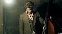 The second scene shows a Mid-shot of another musician holding a cello. Again, this not only relates to the music in what instrument is being played, yet also the use of shadows has been used yet again to portray the mood and emotion of the music. This may also be seen in the musicians posture as his head is bowed down in an almost guilty way, yet also emits a kind of deep or troubled thought which can be understood by the audience through the lyrics of the song.The genre of this music which is Indie/Alternative can be understood, if not through the music, by what the Artist is wearing. This is because it is a suit that appears to be vintage and is also not the usual "on trend" appearance that is used by artist's of a pop, or Rn B genre.
 The next scene is a repeated shot of the first scene. This may have been used to shown the repetition of a part played by this instrument.
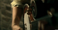 In this scene, a close-up/ cut-in of the musician's arm and guitar is shown. Yet again, the use of shadows has been used again to convey the song's mood. Also from this shot, a rolled up sleeve can be seen. This may portray a kind of traditionally masculine man rather than a jewellery clad excessively muscular kind of masculinity which is used in genres such as pop and Rn B. Further more this also indicates the genre of the piece as again it is a more traditional and less "on trend" appearance.
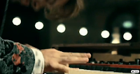 In this shot, a zoom out has been used to show a very wide shot of the musicians performing on some sort of stage. The effect of this is that it appears that the band is playing directly to there audience. Fairy lights have been used for lighting and the use of darkness around the artist has been used again. From this shot a more simple and almost serenading appearance is used which again could convey the meaning of the piece.In this shot a cut-in of the musicians hand playing the piano is used to convey again what instrument is being played. The background,where fairy lights can be see, is slightly bury, meaning the musicians hand and instrument is the main element in this this scene.
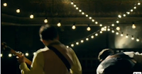 For this scene, the use of "crabbing" is used to show the musicians performing on stage. This shot which is also a medium two shot of the artists shown, is of the back of the musicians which therefore portrays again an almost serenading of a person/ audience that cannot be seen.This could mean that that the song is of a personal meaning as the song. Also the use of fairy lights and darkness where the audience would be is used. This again could convey the mood and the personal meaning(an almost wish I had said) of the song.
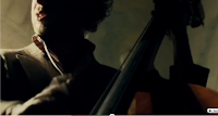 In this shot, a close-up of the musician and instrument can be seen. This shows, as it has on numerous occasions, what instrument is being used in a particular part of the song. The use of darkness is used yet again which could have been used to portray the meaning of the music. Also, from this shot it can just about be seen the suit that the artist is wearing. This may represent the Indie/Alternative genre yet again.
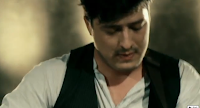 In this scene, a medium close-up of one of the musicians is shown. Again from the artists attire it could be understood that the music is of an alternative/Indie genre. Also as the musician can be seen clearly, may also convey that this singer is the main artist in the band, which normally is the case in most bands.
 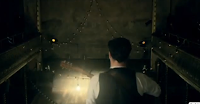 The next shot shows a medium close-up of the back of the musician that was previously shown, performing in an empty room. This could convey the personal and almost wish I had told you meaning of the song. The use of darkness again is used with some source of light in front of the artist. This could represent an understanding of emotion or events that as a result was the reason this song came about.
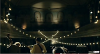 In this shot, a tilt is used to show the musicians performing. Again an almost serenading atmosphere is evident as a result of the use of fairy lights. Furthermore, it can be seen that the band is performing to an invisible audience which could portray the private meaning of the song. However, as the back of the the musicians are shown, it is almost like the audience is also performing with them.This may have been used to portray the insight we are receiving of the band's personal experiences through the song.
Research For Music Video
Now that I have a better grasp of who my target audience is, I have researched into the particular music genre's that they are interestested in by looking at relevent Indie/ Alternative bands and music videos.From this I beleive it will benefit my own media products by using and developing techniques that have been used. These Videos include My Propeller by Artic Monkeys and Little Lion Man by Mumford and Sons.
Profile Of Target Audience.
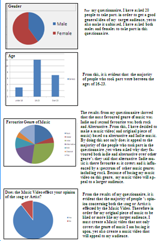
From the results of my Questionaire I have quite a good idea of my target audience.
The age of my target is between the ages of 16-25. From this it is clear that the majority of my target audience are students.
What will this effect?
Because the majority of my target audience are mainly students, this will effect things such as the price of my productse.g the prce of the C.D.
Genre
The music genre I have chosen to represent is Indie/ Alternative. I have chosen to do this as the majority of the people who took part in my questionaire said that this was these were the music genres that they listened to most frequently.
What will this effect?
The genre I have chosen to represent will effect many aspects of my media product. For example because of the Indie/ Alternative genre I am representing I will have to incorparate elements from both the Indie/ Alternative culture such as fashion also and elements from similar existing products such as magazine advertisements and music videos. From researching such things, it will give me a better understanding of the Indie/ Alternative "lifestyle" rather than using typical stereotypical stigma's throughout my products.
Because of new media devices such as the internet and mobile phone application which allow people to watch music videos and download C.D cover art and music online.
What will this effect?
According to the results of my questionaire, this is the second most popular way of watching music videos. Because of this it means that the Music Video I create will be viewed by more people and more frequently. This is because such types of new media means that my target audience can access it wherever they are.
Target Audience Questionaire
In order to create my music video and the relevent media products, I firstly needed to decide which target audience I wanted to represent, and appeal to. To do this I have created a questionaire to distinguish not only the basic age group of my target auidence, yet also which particular music genre they are interested in.
Evaluation of "Betty" Comic Video
BETTY COMIC STRIP EVALUATION
To plan my comic strip trailer I have copied and pasted each image onto separate documents on Microsoft Publisher. After that I have noted what camera shots,transitions and phonological devices I would use.
I have created a trailer using the "Betty" comic strip for one of my parliminary media task. In doing this i have shot, edited and added music to the the music video.
Planning
To plan my comic strip trailer I have copied and pasted each image onto separate documents on Microsoft Publisher. After that I have noted what camera shots,transitions and phonological devices I would use.
Conventions
After filming and editing my music video, I have posted it onto Blogspot. To enable me to do this I had to do two things, one of which was to ceate a Gmail account to allow me to access Blogspot.com.I found using Blogspot useful as I was able to post my media coursework onto it easily and successfully.After that I uploaded my comic strip trailer onto Youtube using the URL address to post the trailer on to my Blog account. In addition to this I also used youtube to find a piece of music that was suitable for my music video.
Technologies
First of all, after choosing what comic strip i would transform into a video, I disected the images by printscreening and pasting the images onto seperate documents on Microsoft Publisher. By doing this,I was able to film each scene without the error of other's entering the frame line of the shot.
When filming the trailor I used a digital Cam corder to capture each shot. While filming i was also exposed to tools such as a tripod. The use of a tripod was effective when filming my Video as it enabled me to have greater control of the camera giving the trailer a smoother and more proffessional portrayel. Also in the task of using the tripod i learnt how to dettach and attach it to the camera.
Another technology that was used whilst filming is the actual Cam corder I used to film the screen. From using this I was able to master devices such as zoom, yet I also mastered other camera shots while filming my Video.Camera shots such as panning and quick shots. By doing this i was again able to give my Music Video a more professional persona, yet also make it interesting for the audience to watch. To edit my comic strip trailer I have used the program Adobe Premier. By using this program I was able to import the shots I have filmed, yet it also allowed me to crop,split and add transitions to the scenes as well as add phonological devices to my trailer.
Phonological
devicesThe music I have used for my Comic strip trailer is "Stole" by Kelly Rowland. I have used this piece of music as I believe it reflects the bullying and isolation that is felt by the main character "Betty" as a result of this.By using this piece of music I believe that it makes my Video appear more professional, yet also because it is a well known song, it will enable the audience to identify with the struggles of the main character.
CORRANATION STREET TRAILER EVALUATION
CORRANATION STREET TRAILER EVALUATION
Subscribe to:
Comments (Atom)


