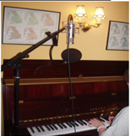
For the back of the Album Cover, I would like to use an image of the Artist. This is because I believe that by doing so, my audience will be able to identify who the music contained in the album is by. The tile of the album/song with also be used on the back of the album. This will create a sense of continuity between both the front and back of my Album cover yet also a sense of continuity between the album and my other Ancillary products. I will also include other features that are used frequently in other album covers such as, the record company, the names of those who were involved in the process of creating the album and a barcode.
Image for Back of C.D
This is the image of the artist I have chosen for the back of my C.D cover

First Attempt- back cover of Album
Editing Process
This is the first attempt of the album back of my C.D product. I have used the first image that was selected from before to be the background. I have used Adobe Photoshop to edit the image. I edited the image by democrating it into a black and white image. Next I have imported the image of the songs/album's title, that was also used on the front cover, onto the image of the piano.After, I have inseted text which includes the Band's/ Artist's name, Track listing, and the band's website.
Futher Annotation
I have used a photo of the artist playing a piano for the main image of my album back. I believe this is effective as it means that my audience are able to identify the instruments that have been used yet also the type of ensemble of the music. This image also creates a sence of continuity between the back and front of the album cover as a image of a piano is used in both. My inspiration for incorparating an image of the instruments used came from viewing the Kooks album cover which also uses this.
I have also used an image of the song's/albums title on the inside cover of the piano. By doing this I have created a sence of continuity between the front snd back of my album cover yet also between my other Ancillary products. Furthermore by doing this, I hope to have created a kind of text related trade mark that when seen will be immediantly associated with the band/ artist I have used.
I have made the main image black and white as I think as a result of this my cover appears more artistic. Yet also as the audience are only presented with the arm of the muscian, the artist appears more mysterious and intriging. The mono chrome image also contrasts well with the colourful front cover making it more visually effective. Yet also as a result of this, The bright red text stands out making it clear and eyecatching.
The text I have used is in red. By doing this I have created a sence of continuity between the front and back of the album cover. I have also incorparated the length of the songs on the Track listings to make my album cover appear more proffessional as a result of using conventions that are frequently used on album cover back's. Finally I have immported a barcode to again make my album cover appear more professional.
Improvements


No comments:
Post a Comment