Basic Idea
For the Front cover of the album that I must create for one of my Ancillary Products, I am using an image that incorporates both, a prop that was used in my Music video, yet also the name of the recorded song that my Music Video was based upon.
The image on the Front cover will be a "Piano" that was used in my Music Video originally. The title of the song will be written on top of this by hand. I believe that by doing this, it will create an album cover that appears more personal, yet also more artistic. This was influenced by the "DRUMS" album cover which also uses a Font that appears to be hand written. The colour of the font that will be used in the song title is the same as the colours of nail vanish used in my Music video. This will create a sense of continuity between the Ancillary products, yet will also create some form of colour based trade mark where from this, the audience will be able to identify this particular artist. I would also like to incorporate the checked shirt that was worn by the artist in my Music Video in some form as I believe that again this will create a sense of continuity between my products. Yet I would also like to include this as I believe it will portray the genre of music through an item of clothing which is stereotypically thought of as an Indie/Alternative Item of clothing.
Photoshoot For Album Cover
Possible Front Cover images
In the Photo shoot for the front of my album cover, I have experimented with different shot types,lighting,and camera settings. I have narrowed this selection down to three images which I believe will be more appropriate, and visually affective for the front of my album cover
 The third image I have chosen is a high-angle shot with a blue tint. I believe that this is effective as not only does the tint make it visually appealing, yet it also reflects the slightly sombre mood of the song that the album itself has been created for. It uses a kind of pathetic fallacy. The piano,and shirt that was used originally in my music video can both be seen. From this it creates a sense a continuity throughout the products I have created. However, as a result of using a blue tint, the title of the song is not as bright and eye catching as I want it to be, meaning that it is not the most significant part of the front cover. Though this can be edited in Microsoft Photo shop.
C.D Cover- First attempt
Editing Process
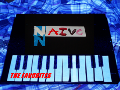
This is my First attempt at creating the cover of my album. I have used the third image that was selected from before to be the background of the album cover. To create this album cover, I have used Microsoft Photo shop to edit the image. I edited the image by using both the sharpen and fake Tilt-shift tool to give the image a slightly blurry effect, yet to also make the blue tint more prominent. Next, I have imported another image (image one from the selection process) cropped then resized it onto the centre of the main image. By doing this I have made the tile of the song and album the main vocal point. Finally I have added the name of the Artist/Band using the Text button.
Further Annotation
For the main image of the front cover, I have made it slightly blurry and made the blue tint more prominent. This is because I wanted the title of the song/ album to be the most visually captivating element of the album. I also wanted the colour of the shirt to reflect the slightly sombre mood of the song that I have created both a Music video and Album cover for. I believe the use of the checked shirt is effective as it means that my audience will be able to identify the specific genre I have created this album cover for, as a result of being visually introduced to a piece of clothing that is stereotypically thought of as being part of the Indie/ Alternative subculture/genre.
My influence for using a piece of clothing that relates to a specific genre came from viewing "the drums" album cover which also uses this technique. The main image itself is of a handmade "piano" that was used originally in my Music Video. My influences for using this idea came from both, the stop animation video"Her morning glory" which uses household items to create different objects, by doing this, a kind of foolery directed toward the audience occurs. Another influence came from the album cover of "blur" who also used images from their music videos. However, my main influence for using the "piano" on the front of my album cover came from viewing "the kooks" album cover. This is because they have used instruments on the front of their album cover,that was used to create their music. I have also done this as I believe that by doing so, it gives the audience insight on what type of genre and ensemble the music contained within the album is.
The font I have used for my album cover is the title of the song/album that I have edited onto my front cover using a previously taken photograph. The font on this image is colourful and clear. From this I believe that my album cover will portray the youthful age of my audience, yet can also be easily read and understood by the viewer. I also believe that as a result of using what was originally hand written font, the album cover appears more personal to the musician. Finally I have used red font that is also underlined and bold for the artist's/band's name. By doing this, it is clear to the audience who the band is, yet also stands out against the white "piano" keys making it visually attractive.
Improvements
Final- C.D Cover
Photoshoot For Album Cover
Possible Front Cover images
In the Photo shoot for the front of my album cover, I have experimented with different shot types,lighting,and camera settings. I have narrowed this selection down to three images which I believe will be more appropriate, and visually affective for the front of my album cover
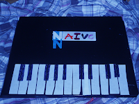
The first image is a crane-shot yet also close-up of the song title. I believe that the colourful hand written song title works well against the dark background making it visually attractive. I also believe as a result of the handwritten font, a more personal and artistic visual portrayal is present.
For the letter N I have used both blue and white font. I believe that again by doing this it makes the Front cover of the album more visually pleasing. For the Font, I have used colours that were also used in my music Video,this can be seen in the nail vanish used in the video.This creates a sense of continuity between my products, yet also, by doing this I hope to create a kind of colour-based trademark that the artist I have used will be associated with.
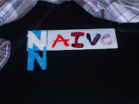 The second image I have chosen a close-up of the songs title. However, in this shot the checked shirt, also used in my music video can be seen.
I believe that the checked shirt works well as the colours of the shirt contrast against the dark background making it visually attractive. The shirt also portrays the genre of the music as it is an item of clothing stereotypically associated with the Indie/alternative subculture and genre. I also believe that as a result of the colourful font that is used, the album appears more youthful. Therefore it is consistent with my target audience, who,after discovering through the questionnaire I
have created are mainly between the ages of 16-25.
For the letter N I have used both blue and white font. I believe that again by doing this it makes the Front cover of the album more visually pleasing. For the Font, I have used colours that were also used in my music Video,this can be seen in the nail vanish used in the video.This creates a sense of continuity between my products, yet also, by doing this I hope to create a kind of colour-based trademark that the artist I have used will be associated with.
 The second image I have chosen a close-up of the songs title. However, in this shot the checked shirt, also used in my music video can be seen.
I believe that the checked shirt works well as the colours of the shirt contrast against the dark background making it visually attractive. The shirt also portrays the genre of the music as it is an item of clothing stereotypically associated with the Indie/alternative subculture and genre. I also believe that as a result of the colourful font that is used, the album appears more youthful. Therefore it is consistent with my target audience, who,after discovering through the questionnaire I
have created are mainly between the ages of 16-25.
 The third image I have chosen is a high-angle shot with a blue tint. I believe that this is effective as not only does the tint make it visually appealing, yet it also reflects the slightly sombre mood of the song that the album itself has been created for. It uses a kind of pathetic fallacy. The piano,and shirt that was used originally in my music video can both be seen. From this it creates a sense a continuity throughout the products I have created. However, as a result of using a blue tint, the title of the song is not as bright and eye catching as I want it to be, meaning that it is not the most significant part of the front cover. Though this can be edited in Microsoft Photo shop.
C.D Cover- First attempt

Editing Process
This is my First attempt at creating the cover of my album. I have used the third image that was selected from before to be the background of the album cover. To create this album cover, I have used Microsoft Photo shop to edit the image. I edited the image by using both the sharpen and fake Tilt-shift tool to give the image a slightly blurry effect, yet to also make the blue tint more prominent. Next, I have imported another image (image one from the selection process) cropped then resized it onto the centre of the main image. By doing this I have made the tile of the song and album the main vocal point. Finally I have added the name of the Artist/Band using the Text button.
Further Annotation
For the main image of the front cover, I have made it slightly blurry and made the blue tint more prominent. This is because I wanted the title of the song/ album to be the most visually captivating element of the album. I also wanted the colour of the shirt to reflect the slightly sombre mood of the song that I have created both a Music video and Album cover for. I believe the use of the checked shirt is effective as it means that my audience will be able to identify the specific genre I have created this album cover for, as a result of being visually introduced to a piece of clothing that is stereotypically thought of as being part of the Indie/ Alternative subculture/genre.
My influence for using a piece of clothing that relates to a specific genre came from viewing "the drums" album cover which also uses this technique. The main image itself is of a handmade "piano" that was used originally in my Music Video. My influences for using this idea came from both, the stop animation video"Her morning glory" which uses household items to create different objects, by doing this, a kind of foolery directed toward the audience occurs. Another influence came from the album cover of "blur" who also used images from their music videos. However, my main influence for using the "piano" on the front of my album cover came from viewing "the kooks" album cover. This is because they have used instruments on the front of their album cover,that was used to create their music. I have also done this as I believe that by doing so, it gives the audience insight on what type of genre and ensemble the music contained within the album is.
The font I have used for my album cover is the title of the song/album that I have edited onto my front cover using a previously taken photograph. The font on this image is colourful and clear. From this I believe that my album cover will portray the youthful age of my audience, yet can also be easily read and understood by the viewer. I also believe that as a result of using what was originally hand written font, the album cover appears more personal to the musician. Finally I have used red font that is also underlined and bold for the artist's/band's name. By doing this, it is clear to the audience who the band is, yet also stands out against the white "piano" keys making it visually attractive.
Improvements
Final- C.D Cover


No comments:
Post a Comment